How the User Interface Changes the Game
The definition of a user interface (UI) is “the space where interactions between humans and computers occur.” Navigating menus, checking ammunition, and managing inventory are just a handful of ways players connect with user interfaces in video games. Unlike in movies and television, the user interface is pivotal to a video game’s overall design and can be the difference between a good and bad player experience. User interfaces can accomplish a lot of things, but the ultimate goal with any UI should be to provide a sufficient amount of information to a player without overtly distracting them.
Source: YouTube
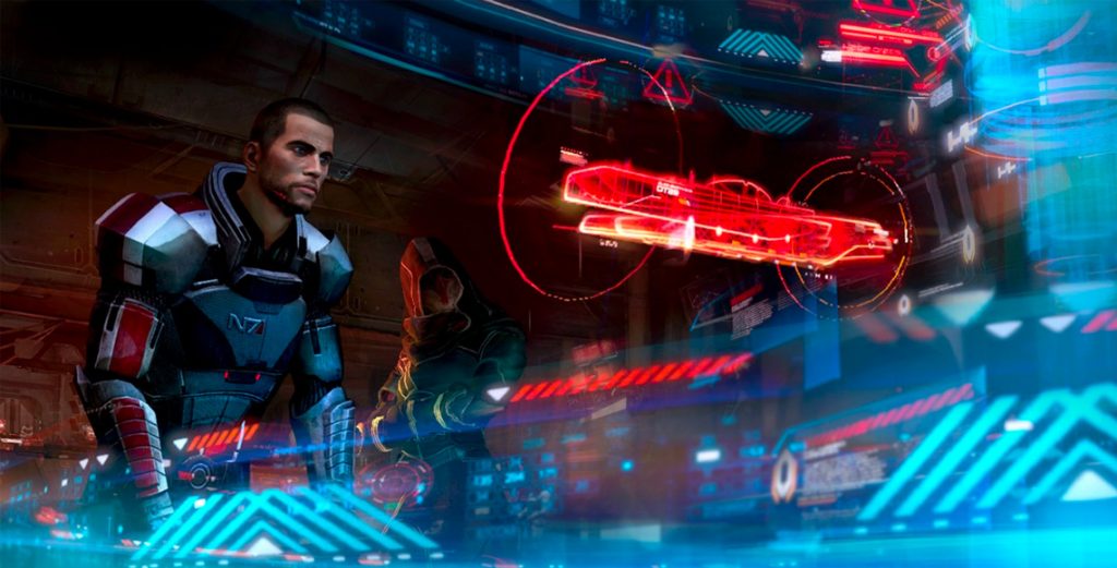
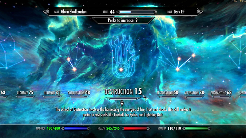
There are a number of different factors that go into making a great game and the ability to make choices is no exception. There is choice in a character’s dialogue, in a character’s looks, even in a character’s enhancements, and developers design these particular user interfaces with player intuition in mind. For example, Mass Effect was the first to introduce the ability to select dialogue options using a radial menu system. Uncharted 4 introduced a very similar mechanic that utilizes the triangle, square and circle buttons of the Dualshock 3. Both of these solutions factored in human intuition to simplify the player’s input into their next experience. But games go deeper than just dialogue. Many games today allow us to choose what our character looks like right down to the dimples on their face. Customization like this could very easily take hours, but games like Fallout use simple sliders to make the experience much smoother. Choices can get even more complex when you consider the various skill trees and upgrade systems found in many games today. The Elder Scrolls: Skyrim took an interesting approach to this mechanic by making your skill tree represent the constellations in the sky. Not only is this solution practical, but it also enhances the player’s experience through its association with the game’s overall story and setting.
Source: Ubisoft Blog
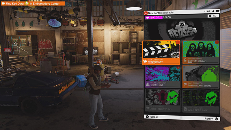
Inventory and loot management further complicate the scope of choice in video games. In first-person shooters, players manage weapon inventory, ammunition and loadouts. In role-playing games, players manage inventory, weapons, armor and other gear. Approaching even one of these categories is tough in itself, but Bungie’s Destiny tackles them both with its beautiful and intuitive menu systems. Rockstar does a similar thing with its weapon management system in Grand Theft Auto. Instead of a traditional menu, GTA uses a simple weapon wheel accessible with the press of a button. To select a different weapon, simply point your control stick in the direction of the weapon you’d like to select. Some games require the management of quests and side missions among other things, and Watch Dogs 2 handles these requirements in a very clever way. The game takes a theme-appropriate approach to quest management by making main and side missions accessible via an app on your in-game phone. Other games require you to scroll through traditional lists to select your next waypoint, but proper, meaningful UI design can make finding those missions worth playing a cakewalk.
Source: Paul Pham
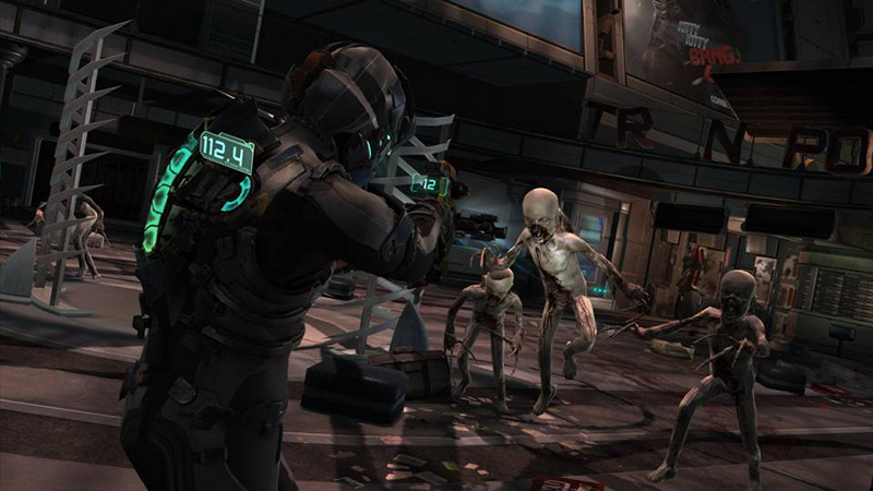
What’s even more surprising about UI elements is how we interact with them without even realizing it. Take health management for instance. In most FPS and action games, your health level is indicated with a full screen cue, typically with various shades of a certain color. These UI choices communicate health levels to you in a very unobtrusive yet clear way. Games like Dark Souls stick to the tried and true way of displaying health and stamina bars in your heads-up display (HUD) but with good reason. Dark Souls is all about health and stamina management and communicating this makes most sense in the HUD. In open world games, traveling efficiently and easily is key, and titles like Ghost Recon Wildlands utilize contextual, interactive maps to make this as accessible as possible. Some games, however, don’t require this level of detail. Stardew Valley is one of these games and makes do with a map of simple icons and landmarks. But there are a handful of games that push the boundary of non-intrusive, yet efficient UI, and Dead Space is one of those games. Dead Space took the concept of the HUD and made it part of its game world. Your ammo count displays as a hologram at the top of your gun and your health displays as a series of blue cells on your back. Decisions such as these push the bounds of passive UI and allow for player choice to be truly accessible.
What’s even more surprising about UI elements is how we interact with them without even realizing it.
User interface design is an integral part of video games that can be served in a variety of ways. Its constant evolution has improved every facet of video games and there may never be one single way to approach it. As new technologies like Virtual Reality surface, we will continue to push the boundaries of information representation to places we’ve never imagined. Someday soon we may reach a point where we forget the user interface is even there.
Header Image Source: Bioware


I think we do. When I play games I forget UI as an aspect. I just use it without giving two thoughts about it being a single entity with the game I am playing. It’s kinda like music. If it works well you forget it is there.
It’s one of those things that when it works, we don’t pay attention to it, but when it doesn’t work, we hate it. As I was researching for this article, I forgot myself how much UI goes into a game especially when it comes to RPG’s.